
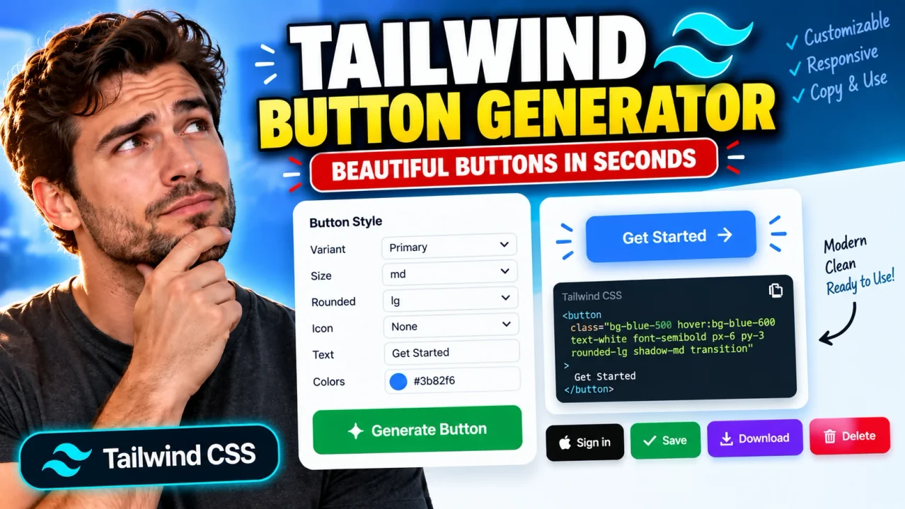
Tailwind Button Generator
Quick answer: The Tailwind Button Generator is a developer utility for creating button styles with Tailwind CSS utility classes. It helps developers configure button appearance and prepare reusable button markup for web interfaces. The exact controls, output syntax, and supported options depend on the tool's implementation.
The Tailwind Button Generator is intended for developers, designers, and frontend learners who want to build consistent button styles without manually assembling every CSS utility class. Buttons are common interface elements used for form submission, navigation, confirmation, cancellation, and other user actions. A reusable button style can help maintain visual consistency across an application.
Tailwind CSS uses small, composable utility classes to control properties such as background color, text color, padding, rounded corners, borders, typography, and hover behavior. A button generator provides a more visual way to work with these classes, allowing developers to explore styling combinations and use the resulting code in their projects.
What Can You Create with Tailwind Button Generator?
- Primary buttons: Prominent controls for important actions, such as saving changes or submitting a form.
- Secondary buttons: Less prominent actions that complement a primary call to action.
- Outline buttons: Buttons that use borders to distinguish themselves from filled controls.
- Rounded buttons: Styles that use corner-radius utilities to create softer shapes.
- Interactive states: Hover and focus styles, when supported by the selected configuration.
- Reusable markup: Button HTML that can be adapted for a website or application.
These are common Tailwind button styling patterns, not a verified inventory of controls in this particular generator. Check the generated result to confirm which options are actually supported.
How to Use Tailwind Button Generator?
- Choose the available style controls. Select the button's visual properties using the options exposed by the generator.
- Adjust the appearance. Configure available properties such as color, padding, shape, border, typography, and interaction states.
- Review the result. Inspect the button preview, if provided, and verify that the selected styles meet your design requirements.
- Copy and integrate the code. Use the generated markup or class string if the tool provides it, then test it in your application.
The exact interface and export workflow should be confirmed against the deployed tool. Do not assume that every property or output format is available.
Input and Output Example
A typical Tailwind button can be represented with HTML and utility classes. The following example illustrates a common primary-button pattern; it is an example of Tailwind CSS usage rather than a verified output from this specific generator.
Example input configuration
- Style: Filled primary button
- Background: Indigo
- Text: White
- Padding: Horizontal 16px, vertical 8px
- Corner radius: Medium
- Hover state: Darker indigo
Example output
<button
  type="button"
  class="rounded-md bg-indigo-600 px-4 py-2 text-white hover:bg-indigo-700 focus-visible:outline-2 focus-visible:outline-offset-2 focus-visible:outline-indigo-600"
>
  Save changes
</button>
This example uses standard Tailwind-style utility naming. The precise classes accepted by a project depend on its Tailwind CSS version and configuration. The button also uses a semantic HTML element and an explicit type attribute to avoid unintentionally submitting a form.
Tailwind Button Class Reference
The following reference table explains common utility classes that can be combined to create button styles. It is a general Tailwind CSS reference, not a list of verified generator controls.
| Design property | Example utility | Effect |
|---|---|---|
| Background | bg-indigo-600 |
Applies an indigo background color. |
| Text color | text-white |
Sets the text color to white. |
| Horizontal padding | px-4 |
Adds horizontal padding using the configured spacing scale. |
| Vertical padding | py-2 |
Adds vertical padding using the configured spacing scale. |
| Corner radius | rounded-md |
Applies a medium corner radius. |
| Hover background | hover:bg-indigo-700 |
Changes the background when the pointer hovers over the button. |
| Focus outline | focus-visible:outline-2 |
Applies a two-unit outline width when the element matches the focus-visible state. |
| Disabled appearance | disabled:opacity-50 |
Reduces opacity when the button is disabled. |
Utility classes can be combined on the same HTML element. Their availability and exact behavior depend on the Tailwind CSS version and project configuration. For the authoritative utility reference, consult the official Tailwind CSS documentation.
How Tailwind Button Styling Works
Tailwind CSS styles an element by combining utility classes in its class attribute. Each utility represents a particular styling rule, while variant prefixes apply a rule under a condition such as hover, focus, or disabled state.
For example, bg-indigo-600 controls the background, text-white controls the foreground text, and rounded-md controls the corners. The hover:bg-indigo-700 variant applies a different background during pointer hover. These classes work together without requiring a dedicated CSS class for every button design.
A generator can make this composition easier by presenting style settings in a visual interface. When the tool produces a class string or HTML snippet, the result should still be reviewed for semantic HTML, readability, accessibility, and compatibility with the target project.
Technical Edge Cases and Limitations
- Tailwind version differences: Utility names, configuration conventions, and available features can differ between versions. Confirm that the generated classes match your installed version.
- Project configuration: Custom themes, colors, spacing values, and design tokens can affect whether a class is available or what it represents.
- Accessibility: Visual styling alone does not provide accessible names, keyboard behavior, or adequate color contrast. Review these independently.
- Disabled controls: Styling a button with a disabled-state variant does not disable it by itself. Use the appropriate HTML
disabledattribute or application logic. - Form behavior: Choose the correct button type. A button inside a form may submit the form if its type is omitted.
- Hover-only interaction: Do not rely on hover styling as the only indication of interaction, particularly for keyboard and touch users.
- Unsupported controls: If the generator does not expose a particular property, the desired style may need to be added manually to the resulting code.
Accessibility checklist
- Use descriptive button text that communicates the action.
- Provide visible keyboard focus styling.
- Check text and background contrast.
- Use native button semantics for actions and links for navigation.
- Ensure disabled styling corresponds to actual disabled behavior.
For accessible button semantics, see the MDN documentation for the HTML button element.
Frequently Asked Questions
What does Tailwind Button Generator do?
It is intended to help users create button styling based on Tailwind CSS utility classes. The specific controls and generated output depend on the deployed implementation.
What does a Tailwind button generator output?
A typical generator may produce an HTML button snippet or a Tailwind CSS class string. Confirm the actual output formats supported by this tool before relying on a particular export workflow.
Can I use generated classes in an existing Tailwind project?
Yes, provided the classes are supported by your installed Tailwind CSS version and project configuration. Test the markup in your application and verify that custom theme values and state variants behave as expected.
How do I add hover and focus styles?
Tailwind commonly uses variants such as hover: and focus-visible: before utility classes. For example, hover:bg-indigo-700 changes a background on hover, while focus-visible utilities can make keyboard focus easier to see.
Does changing a button's appearance make it accessible?
No. Styling is only one part of accessibility. Use semantic HTML, meaningful button text, visible keyboard focus, sufficient contrast, and correct disabled behavior.
Does the generator process everything locally?
The processing location and data-handling behavior have not been established by the supplied tool information. Consult the tool's implementation and privacy documentation before making assumptions about local processing or data transmission.
Author
Author Name: Michael Turner
Author Description: Frontend Developer specializing in HTML, CSS, JavaScript, and utility-first interface development.
Technical Review: This content explains common Tailwind CSS button patterns, semantic HTML considerations, and implementation checks. The deployed generator's controls and output behavior should be verified against its actual implementation.