
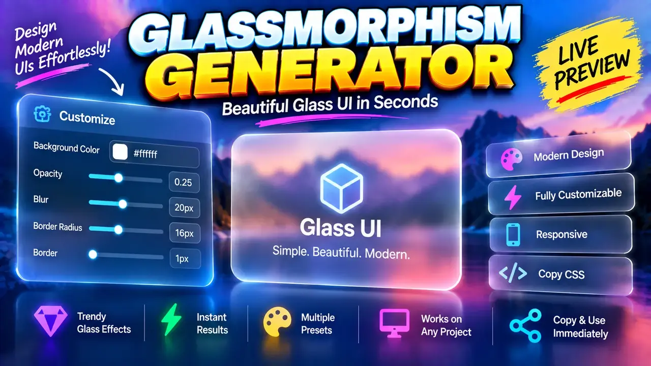
Free Glassmorphism Generator - Live Css Code Preview
Quick answer: The Free Glassmorphism Generator - Live Css Code Preview is a CSS design generator for creating glass-like interface elements using translucent backgrounds, background blur, borders, and subtle shadows. It is intended for developers, UI designers, and frontend learners who want to explore glassmorphism styles and preview the CSS needed to reproduce the effect.
Glassmorphism is a user interface design technique that creates a frosted-glass appearance by combining transparency, backdrop blur, a light border, and carefully controlled shadows. It is commonly used for cards, navigation panels, modal windows, dashboard widgets, and floating interface elements.
The Free Glassmorphism Generator - Live Css Code Preview is designed around a practical workflow: adjust visual properties, inspect the resulting appearance, and use the generated CSS as a starting point for a web interface. The supplied tool name identifies live CSS preview as a central feature. Exact control names, available presets, export options, and processing behavior depend on the deployed implementation.
TL;DR / Key Takeaways
- Primary function: Create CSS styles for a frosted-glass interface effect.
- Main technique: Combine translucency, backdrop filtering, borders, and shadows.
- Expected output: CSS declarations that can be adapted for interface components.
- Best suited for: Frontend developers, web designers, prototypers, and CSS learners.
How to Use Free Glassmorphism Generator - Live Css Code Preview?
- Choose a glass surface: Identify the card, panel, navigation area, or other interface element you want to style.
- Adjust the appearance: If the generator exposes these controls, experiment with background opacity, blur intensity, border color, border transparency, and shadow settings.
- Inspect the preview: Review how the translucent surface appears against the preview background. A contrasting background makes the blur and transparency easier to evaluate.
- Review the CSS: Copy or adapt the generated declarations if the interface provides a code-copy feature. Confirm the output before using it in a production stylesheet.
Input and Output Example
The following example illustrates the CSS technique behind a basic glassmorphism card. It is a representative implementation, not a claim about the exact CSS emitted by the live generator.
Example input settings
- Background color: white
- Background opacity: 20%
- Backdrop blur: 12px
- Border: 1px solid white with 30% opacity
- Corner radius: 16px
- Shadow: soft, low-opacity black
Example CSS output
.glass-card {
  background: rgba(255, 255, 255, 0.2);
  backdrop-filter: blur(12px);
  -webkit-backdrop-filter: blur(12px);
  border: 1px solid rgba(255, 255, 255, 0.3);
  border-radius: 16px;
  box-shadow: 0 8px 32px rgba(0, 0, 0, 0.12);
}
Apply the class to an HTML element to create the translucent surface. The visible frosted-glass effect depends on the content and colors behind the element; the CSS alone does not guarantee a strong blur effect on a plain, uniform background.
CSS Glassmorphism Parameter Reference
These are common CSS properties used to implement glassmorphism. They provide a technical reference for interpreting or refining generated styles. They are not a verified inventory of the generator's user-interface controls.
| CSS property | Example value | Visual effect |
|---|---|---|
background |
rgba(255, 255, 255, 0.2) |
Creates a translucent white surface. |
backdrop-filter |
blur(12px) |
Blurs the content behind the element. |
-webkit-backdrop-filter |
blur(12px) |
Provides a prefixed declaration for compatible WebKit-based environments. |
border |
1px solid rgba(255, 255, 255, 0.3) |
Defines a subtle translucent edge. |
border-radius |
16px |
Rounds the corners of the glass panel. |
box-shadow |
0 8px 32px rgba(0, 0, 0, 0.12) |
Adds depth and separation from the background. |
How Does Glassmorphism CSS Work?
Glassmorphism is a combination of several independent CSS effects rather than a single CSS property. The result changes with the background, the element's transparency, and the surrounding layout.
1. Background transparency
An alpha value controls how opaque a color appears. In rgba(255, 255, 255, 0.2), the final component is the alpha value: 0 is fully transparent and 1 is fully opaque. A value of 0.2 gives the white background 20% opacity.
2. Backdrop blur
backdrop-filter: blur(12px) applies a blur to the pixels behind the element, within the region affected by the filter. This differs from filter: blur(12px), which blurs the element itself and its rendered contents.
3. Border and shadow
A light, translucent border defines the panel's edge. A soft shadow separates the panel from the background and creates a layered appearance. Excessive blur, opacity, or shadow can reduce visual clarity and make text difficult to read.
4. Live visual iteration
A live-preview workflow lets designers compare property combinations before incorporating CSS into a project. To assess the effect accurately, use a background containing some variation in color, texture, or imagery. A solid background provides less visible detail for the backdrop blur to affect.
Technical Edge Cases and Limitations
| Situation | What to check |
|---|---|
| Uniform background | Blur may be difficult to notice because there is little variation behind the glass surface. |
| Browser compatibility | Verify backdrop-filter support in the browsers and versions targeted by your project. |
| Low-contrast text | Increase text contrast or adjust the glass opacity to preserve readability. |
| Nested or overlapping elements | Check stacking order, clipping, and the region affected by backdrop filtering. |
| Performance-sensitive layouts | Test large or numerous blurred surfaces on representative devices. |
| Copied CSS in an existing project | Check for conflicting class names, existing background declarations, and project-specific styles. |
Accessibility considerations
Glass effects should not take priority over readable content. Test foreground and background contrast against the actual backgrounds that may appear behind the element. Avoid relying on blur or transparency alone to communicate a state, and provide a sufficiently opaque fallback where the effect is unsupported or unsuitable.
What this description does not establish
The supplied tool information does not specify the complete list of controls, whether presets are available, whether CSS can be copied or downloaded, which browsers are tested, or whether processing occurs entirely in the browser. These details should be confirmed against the deployed tool before being advertised as guaranteed features.
Technical References
- MDN Web Docs: backdrop-filter — explains how CSS filters affect the content behind an element.
- MDN Web Docs: opacity — documents opacity behavior and its effects on rendered elements.
Author Information
Author Name: Jordan Mitchell
Author Description: Frontend Development and CSS Interface Design Specialist focused on browser-based styling techniques, responsive interfaces, and practical CSS implementation.
Technical Review: The CSS examples illustrate standard glassmorphism techniques using background alpha transparency, backdrop filtering, borders, and shadows. Verify the deployed generator's actual controls and generated declarations before treating the examples as its exact output.