
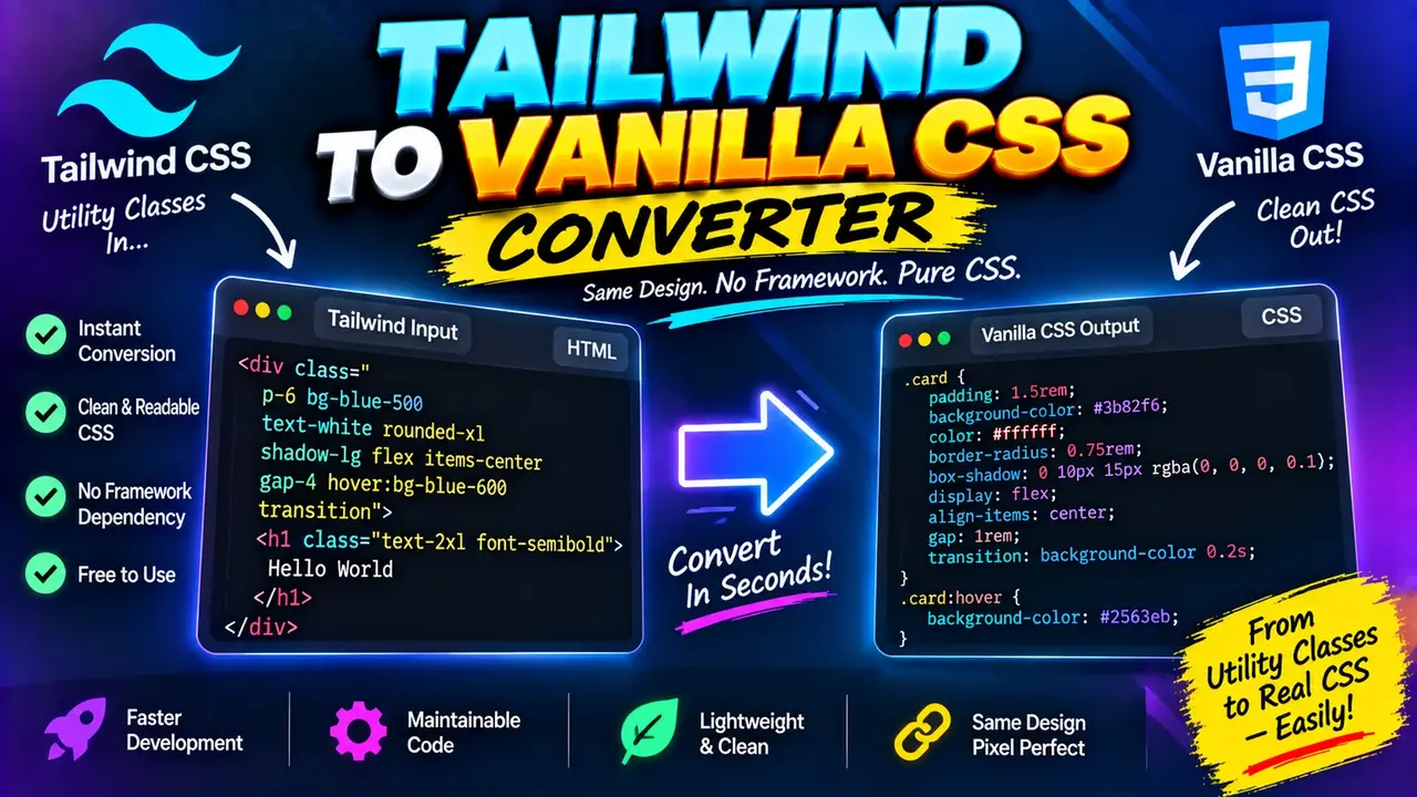
Free Tailwind To Vanilla Css Converter
A Free Tailwind To Vanilla Css Converter is a developer utility designed to help convert Tailwind CSS utility classes into equivalent standard CSS declarations. It helps developers translate utility-based styling into readable CSS rules that can be used in conventional stylesheets, custom components, or projects that do not use Tailwind CSS.
Quick answer: The Free Tailwind To Vanilla Css Converter helps transform Tailwind CSS classes such asflex,items-center,p-4, andtext-centerinto standard CSS properties such asdisplay: flex,align-items: center,padding: 1rem, andtext-align: center. The exact output depends on the Tailwind version, theme configuration, and utilities supported by the converter.
Why Convert Tailwind CSS to Vanilla CSS?
Tailwind CSS uses small utility classes directly in HTML to apply styling. A single element may contain several classes that control layout, spacing, typography, colors, borders, and responsive behavior. This approach can be convenient during development, but some projects require conventional CSS rules instead.
Converting Tailwind classes to vanilla CSS can help when:
- Refactoring components: Move repeated utility combinations into named CSS classes.
- Working without Tailwind: Reuse styling in projects that rely on ordinary CSS stylesheets.
- Learning CSS: Understand the declarations behind familiar Tailwind utilities.
- Improving maintainability: Organize styles into selectors that are easier to review and document.
- Integrating existing code: Adapt utility-class markup when working with a conventional front-end codebase.
For example, a group of classes such as flex items-center justify-center p-4 can be represented by a conventional CSS rule that combines flexbox alignment and padding. The conversion is a translation of styling instructions, not a replacement for testing the resulting layout in the target application.
How to Use Free Tailwind To Vanilla Css Converter?
- Enter Tailwind classes: Paste the utility classes you want to translate into CSS. If the converter accepts complete HTML snippets, you can provide the supported markup instead.
- Run the conversion: Start the conversion using the tool's available action.
- Review the generated CSS: Check selectors, property values, responsive variants, and any utility classes that may require manual adjustment.
- Copy the result: Use the generated CSS in your stylesheet and connect the corresponding selectors to your HTML elements.
Input: Tailwind CSS utility classes or supported markup.
Output: Standard CSS declarations or rules representing the supported utilities.
The exact input interface, accepted markup, output formatting, and available conversion options depend on the implementation of the converter.
Tailwind CSS to Vanilla CSS: Input and Output Example
The following example illustrates how common Tailwind utilities map to standard CSS. It is a representative conversion example, not a claim that every class combination is supported by the live converter.
Input
<div class="flex items-center justify-center p-4 text-center">
  Hello, world!
</div>
Equivalent CSS
.example {
  display: flex;
  align-items: center;
  justify-content: center;
  padding: 1rem;
  text-align: center;
}
Corresponding HTML
<div class="example">
  Hello, world!
</div>
This example assumes the default Tailwind spacing scale, where p-4 commonly represents padding: 1rem. The original element also needs the example class for the generated rule to apply.
Tailwind Utility to CSS Mapping Reference
The following table provides a practical reference for translating common Tailwind utility classes into conventional CSS. Values shown for theme-dependent utilities assume typical default Tailwind configuration and may differ in customized projects.
| Tailwind Class | Vanilla CSS Declaration | Purpose |
|---|---|---|
flex |
display: flex; |
Creates a flex container. |
grid |
display: grid; |
Creates a grid container. |
block |
display: block; |
Uses block-level layout. |
hidden |
display: none; |
Hides the element. |
items-center |
align-items: center; |
Aligns flex or grid items on the relevant axis. |
justify-center |
justify-content: center; |
Centers content along the main or inline axis. |
text-center |
text-align: center; |
Centers inline text content. |
font-bold |
font-weight: 700; |
Applies bold font weight. |
rounded |
border-radius: 0.25rem; |
Applies the typical default rounded corner. |
w-full |
width: 100%; |
Uses the full available containing-block width. |
h-full |
height: 100%; |
Uses the full containing-block height when that height can be resolved. |
p-4 |
padding: 1rem; |
Applies spacing to all four sides under the typical default scale. |
m-4 |
margin: 1rem; |
Applies margin on all four sides under the typical default scale. |
text-sm |
font-size: 0.875rem; line-height: 1.25rem; |
Uses a typical default small text size and line height. |
overflow-hidden |
overflow: hidden; |
Clips overflowing content. |
These mappings are reference examples. Exact values can vary by Tailwind version, configuration, plugins, and utility semantics. Verify theme-dependent declarations before using converted CSS in production.
How the Conversion Works
A Tailwind-to-CSS converter generally interprets utility classes and translates their styling meaning into CSS declarations. Depending on the implementation, it may also generate selectors and group declarations that belong to the same element.
- Class identification: Identify the utility tokens, such as
flex,p-4, ortext-center. - Utility mapping: Associate each recognized utility with one or more CSS properties and values.
- Declaration generation: Produce standard CSS declarations for the recognized classes.
- Selector generation: Where supported, associate declarations with a CSS selector that can replace the original utility list.
- Variant handling: If supported, preserve responsive or state-dependent behavior using media queries, pseudo-classes, or other appropriate CSS structures.
Unlike a simple string replacement, a faithful conversion must account for the context in which a class operates. Responsive variants, arbitrary values, pseudo-elements, dark-mode variants, and theme-defined colors can require more than a single property declaration.
Responsive Classes, States, and Arbitrary Values
Tailwind classes can encode conditions as well as declarations. These conditions must be preserved if the converted stylesheet is intended to behave like the original.
| Tailwind Pattern | Typical CSS Representation | Important Consideration |
|---|---|---|
md:flex |
A display: flex rule inside an appropriate media query. |
The breakpoint must match the project's configured breakpoint. |
hover:bg-blue-500 |
A selector using :hover with a background-color declaration. |
The color depends on the Tailwind theme and version. |
focus:outline-none |
A focus-state rule affecting the outline. | Check accessibility and provide a visible focus treatment when appropriate. |
w-[320px] |
width: 320px; |
Arbitrary-value support depends on the converter's parser. |
dark:bg-black |
A dark-mode conditional rule with a background-color declaration. | The selector or media condition depends on the project's dark-mode strategy. |
These patterns describe common conversion strategies, not verified support guarantees for this particular implementation. Inspect the generated output for missing conditions or altered breakpoints.
Edge Cases and Limitations
Theme-Dependent Values
Utilities such as bg-primary, custom spacing tokens, and configured font families may depend on project-specific Tailwind configuration. A converter that does not have access to that configuration may be unable to reproduce the exact original values.
Responsive and State Variants
Classes such as sm:grid, hover:underline, and focus:ring-2 can require media queries, pseudo-classes, or multiple declarations. If variant conversion is unavailable or incomplete, the resulting CSS may not preserve the original behavior.
Arbitrary Values
Utilities such as top-[13px] or grid-cols-[1fr_2fr] express values outside the conventional utility scale. Their conversion requires correct parsing of brackets, underscores, functions, and nested syntax.
Conflicting Utilities
Classes such as block and flex specify different display modes. Their behavior depends on the generated CSS rules, specificity, source order, and stylesheet cascade. A converter must not assume that the final visual result is always determined by the left-to-right order of class names in HTML.
Unsupported or Invalid Classes
If a utility is unknown, malformed, plugin-generated, or specific to a customized configuration, the converter may not be able to translate it. Review the output and consult the project's Tailwind configuration when a declaration is missing.
Preserving Visual Behavior
Matching CSS declarations is only part of the conversion. The replacement stylesheet must also preserve selector scope, responsive conditions, pseudo-states, CSS custom properties, and interactions with existing styles. Always test the converted component in the target layout.
Frequently Asked Questions
Can Tailwind CSS classes be converted into standard CSS?
Yes. Common utilities can be represented by standard CSS declarations. For example, flex maps to display: flex, while text-center maps to text-align: center. Complex variants and custom theme values may require additional handling.
Does converting Tailwind CSS remove the need for Tailwind?
For the converted styles, conventional CSS can replace the corresponding utility classes if all required declarations and conditions are preserved. Other parts of the project may still depend on Tailwind, so review the complete application before removing the framework.
Can responsive Tailwind classes be converted?
Responsive utilities generally need corresponding CSS media queries. The correct conditions depend on the project's breakpoint configuration and whether the converter supports responsive variants.
What happens to custom Tailwind colors and spacing values?
Custom values require access to the relevant configuration or an explicit mapping. Without that information, the output may need manual edits to match the original theme.
Will the converted CSS look exactly like the original page?
Not necessarily. Visual equivalence depends on complete utility coverage, correct CSS values, preserved variants, selector behavior, stylesheet order, and the surrounding application styles. Test the converted result in context.
Can I convert arbitrary Tailwind values?
Arbitrary values such as w-[320px] can be translated when the converter recognizes the relevant syntax. Verify support for nested expressions, special characters, and complex values before relying on automatic conversion.
Technical References
- Official Tailwind CSS documentation — utility classes, responsive design, variants, and theme configuration.
- MDN CSS reference — standard CSS properties, selectors, media queries, and cascade behavior.
Author Information
Author Name: Jordan Mitchell
Author Description: Front-End Development Specialist focused on CSS architecture, responsive interfaces, and maintainable web styling.
Technical Review: This content explains representative Tailwind-to-CSS mappings and highlights configuration-dependent behavior, variant handling, and stylesheet-cascade considerations. Confirm that the converter's actual implementation supports each required utility before publishing feature-specific claims.