
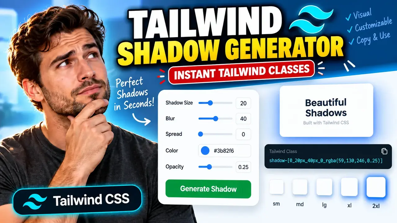
Tailwind Shadow Generator - Create CSS Shadows
Quick answer: The Tailwind Shadow Generator is a CSS shadow generation utility designed to help developers create box-shadow styles for web interfaces and work with shadow styling in Tailwind CSS projects. It helps users explore shadow values and prepare CSS shadow declarations for UI elements such as cards, buttons, modals, and panels.
The Tailwind Shadow Generator - Create CSS Shadows is intended for frontend developers, UI designers, and learners who need to create or customize shadow effects. Instead of repeatedly writing CSS shadow declarations from scratch, a shadow generator can provide a more convenient way to experiment with shadow properties and translate visual design choices into code.
CSS shadows add depth to interface components. A subtle shadow can separate a card from its background, while a wider, softer shadow can make a dialog or floating panel appear elevated. In Tailwind CSS projects, shadow utilities offer a class-based way to apply predefined or customized shadow styles.
Key Takeaways
- Primary purpose: Create CSS shadow styling for interface components.
- Technical foundation: CSS
box-shadowand Tailwind CSS shadow utilities.- Common use cases: Cards, buttons, dialogs, dropdowns, and floating panels.
- Important distinction: A CSS shadow declaration and a Tailwind utility class are different output formats.
How to Use Tailwind Shadow Generator - Create CSS Shadows?
- Choose the shadow appearance: Decide how far the shadow should extend, how soft its edges should look, and which direction it should appear to fall.
- Adjust shadow properties: Where supported by the interface, customize horizontal offset, vertical offset, blur radius, spread radius, and color.
- Review the result: Inspect the preview if provided and check whether the shadow has sufficient contrast against the element and page background.
- Copy the generated code: Use the output in a CSS stylesheet or adapt it to the shadow syntax supported by your Tailwind CSS version.
The exact controls and export options depend on the deployed generator interface. The tool's supplied name establishes its shadow-generation purpose, but does not independently verify specific controls, live preview behavior, preset availability, or download features.
CSS Box Shadow: Input and Output Example
The CSS box-shadow property accepts a sequence of values describing a shadow's offsets, blur, spread, and color. The following example demonstrates the underlying CSS syntax used to create a shadow for a card.
Example CSS
.card {
  box-shadow: 0 4px 12px 0 rgba(0, 0, 0, 0.12);
}
How to Read the Values
0: Horizontal offset; the shadow does not shift left or right.4px: Vertical offset; the shadow is positioned below the element.12px: Blur radius; the shadow edges become softer.0: Spread radius; the shadow is not expanded or contracted through spread.rgba(0, 0, 0, 0.12): A black shadow with 12% opacity.
This is an illustrative CSS example, not a verified output captured from the live Tailwind Shadow Generator.
Equivalent Tailwind CSS Approach
<div class="shadow-md">
  Card content
</div>
The shadow-md class uses the shadow definition provided by the project's Tailwind CSS configuration and version. It should not be assumed to reproduce the exact pixel values of the preceding custom CSS declaration. If an exact shadow is required, use the arbitrary shadow-value syntax supported by the installed Tailwind CSS version or define a reusable custom utility.
CSS Shadow Parameter Reference
The following table describes the standard CSS properties and values that determine a box shadow. These are CSS concepts relevant to shadow generation; the exact parameters exposed by this particular interface have not been independently verified.
| Parameter | Example | Effect |
|---|---|---|
| Horizontal offset | 0px |
Moves the shadow left or right. Positive values move it right. |
| Vertical offset | 4px |
Moves the shadow up or down. Positive values move it down. |
| Blur radius | 12px |
Controls softness. A larger non-negative radius produces a more diffuse shadow. |
| Spread radius | 0px |
Expands or contracts the shadow shape before blur is applied. |
| Shadow color | rgba(0, 0, 0, 0.12) |
Sets the shadow hue and transparency. |
| Inset keyword | inset |
Places the shadow inside the element rather than outside it. |
| Multiple shadows | 0 1px 2px #0002, 0 4px 8px #0001 |
Layers shadow effects using comma-separated shadow definitions. |
How Does CSS Shadow Generation Work?
A CSS shadow generator helps assemble the values used by the box-shadow property into a valid declaration. The general syntax for an outer shadow is:
box-shadow: offset-x offset-y blur-radius spread-radius color;The horizontal and vertical offsets position the shadow relative to the element. Blur softens the edges, spread changes the shadow's size, and color determines its appearance. The spread radius can be negative, allowing the shadow to shrink. The blur radius cannot be negative.
Tailwind CSS adds another layer: developers can use built-in shadow utility classes or custom values, depending on the installed version and project configuration. A generator's CSS output may therefore need to be translated into a Tailwind class or a custom utility before it fits the project's styling conventions.
Shadow Design Examples
| UI element | Design direction | Practical consideration |
|---|---|---|
| Content card | Soft, low-opacity shadow | Separate the card from the background without competing with text. |
| Primary button | Small shadow or no shadow | Keep the label and interactive state visually prominent. |
| Dropdown menu | Moderate blur and visible offset | Make the menu boundary clear over nearby content. |
| Modal dialog | Broader, diffuse shadow | Reinforce elevation without making the overlay excessively dark. |
| Inset field | Inner shadow | Use carefully so the field remains legible and accessible. |
Edge Cases and Limitations
- Negative blur: CSS does not allow a negative blur radius. Use a non-negative length.
- Negative spread: Negative spread values are valid and can make the shadow smaller.
- Transparent colors: Very low opacity may make a shadow difficult to see on a light background.
- Multiple shadows: Comma-separated shadow layers can create richer effects, but order and contrast influence the final appearance.
- Inset shadows: The
insetkeyword changes the shadow from an outer effect to an inner effect. - Tailwind version differences: Utility names, theme configuration, and arbitrary-value syntax can vary across project versions. Check the installed Tailwind CSS documentation before copying a class.
- Clipping and stacking: Shadows may be clipped by ancestor elements or obscured by overlapping elements, depending on layout and overflow settings.
- Unverified interface behavior: The supplied tool details do not establish the exact validation rules, presets, preview mechanism, or export capabilities of the deployed generator.
Frequently Asked Questions
What is the difference between CSS box-shadow and a Tailwind shadow class?
box-shadow is a native CSS property that accepts explicit shadow values. A Tailwind shadow class applies a shadow definition through the utility system and project configuration.
Which values control the appearance of a CSS shadow?
The main values are horizontal offset, vertical offset, blur radius, spread radius, and color. The optional inset keyword creates an inner shadow, and comma-separated definitions allow multiple shadow layers.
Can a generated CSS shadow be used directly in Tailwind CSS?
Plain CSS output can be placed in a stylesheet. To use the same effect through Tailwind utilities, convert the values to supported arbitrary-value syntax or configure a reusable custom shadow. Verify compatibility with your project's Tailwind CSS version.
Can CSS shadows use transparency?
Yes. CSS color formats such as rgba() and modern color syntax can represent partially transparent shadows. Transparency helps soften the effect and reduce visual heaviness.
Why does my shadow appear cut off?
A shadow may be clipped by an ancestor with restrictive overflow settings or hidden behind another element. Inspect the parent layout, stacking order, and overflow properties when the shadow does not appear as expected.
Does this generator support live previews, presets, or downloads?
Those specific interface features have not been verified from the supplied tool details. Check the deployed generator itself to determine which controls and output actions are available.
Technical References
- MDN Web Docs: CSS box-shadow — syntax, shadow layers, offsets, blur, spread, and inset behavior.
- Tailwind CSS Documentation: Box Shadow — utility classes and version-specific shadow customization.
Author
Author Name: Michael Turner
Author Description: Frontend Development Specialist focused on CSS architecture, responsive interface styling, and utility-first CSS workflows.
Technical Review: The CSS syntax, shadow parameter explanations, and distinction between native CSS declarations and Tailwind shadow utilities are presented for technical clarity. The deployed generator's specific controls and implementation have not been independently verified.